The creation of a new visual brand for New Zealand’s only UNESCO City of Design was always going to be a major undertaking. Whanganui’s creative leaders took on the challenge.
Creative leaders and entrepreneurs in Whanganui are being invited to adopt a newly created tohu after a painstaking community process of design.
The unique mark has been developed by Whanganui & Partners – the district council’s economic development agency – to identify products, designs and projects from New Zealand’s only UNESCO City of Design.
Whanganui won City of Design status in November 2021. The designation recognises the city’s 800-year history of design and its contemporary contributions to creativity.
Three years later, the city has a badge of origin and authenticity to celebrate the designation and the city’s inclusion in the global Creative Cities Network.
“It will amplify our story and elevate the creativity that comes from New Zealand’s one and only UNESCO City of Design,” says Rebecca Black, Strategic Lead Marketing at Whanganui & Partners.
Black says the visual brand is expected to bring a range of benefits to Whanganui, including lifting the local economy by supporting business and industry, attracting tourism, students and investment, and further shaping a close-knit community of creatives.
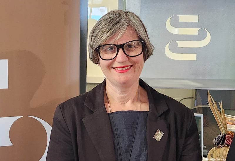
Dr Emma Bugden, Strategic Lead Creative Industries and Arts at Whanganui & Partners, said the economic development team was excited and proud to unveil the tohu after a lengthy process of community engagement and development.

“Whanganui UNESCO City of Design is an enduring, long-term project so we embarked on developing a tohu in a slow and steady way, because it’s not something that’s just for now.
“We’re building a brand for Whanganui for the long-term.”
Bugden said the tohu was both a symbol of identity and a quality mark for businesses that would sit alongside, complement and work together with existing brand marks.
It has been introduced quietly across key creative touchpoints in the city since the middle of the year.
Local designers, manufacturers, creative businesses, and cultural, educational and civic institutions are now being invited to adopt it.
The tohu is free to access and use, but can be used only on products designed in the Whanganui River region by businesses, organisations or sole traders based in the region.
Users must also agree that their product seeks to make a positive contribution to the community and that their business is committed to sustainable development.
Certain products are excluded from carrying the tohu. These include vaping, smoking, gambling and alcohol products.
“Businesses producing these products are still part of the City of Design. They’re doing creative things, they’ve got wonderful businesses and they will still benefit from being in the City of Design – but they won’t be able to use the tohu on their products,” Black said.
The decision is a tough one in a city with a growing reputation for boutique distilleries and micro breweries, but comes after consultation with iwi partners.
“It reflects the commitment we have to uphold local values,” Bugden said. “If you represent the river in your logo, then you have to commit to that.
“There have been a lot of interesting discussions and I’ve learnt so much through this process. It’s certainly been a robust process and it will hopefully set the tohu up for enduring, meaningful longevity.”
Shaped by the awa
The tohu was developed in partnership with business leaders, design and art stakeholders, and iwi.
“We asked for opinions before we started to develop anything,” Black said.
“We weren’t just looking for agreement or sign-off on everything – we wanted to make sure that right from the start we were hearing the voices of these people that we considered to be really important.
“Among them was a group of likely early adopters, people from Heads Road design and manufacturing businesses like Pacific Helmets, iwi arts representatives including Cecelia Kumeroa on behalf of Te Rūnanga o Tūpoho, and Rāwiri Tinirau on behalf of Te Rūnanga o Tamaūpoko, and we talked to a lot of people from different sectors and industries.
“We had to work out whether this was a proposition that was worth pursuing, if there was a need for it, and if people thought it was viable and would want to use this kind of mark on their products.
“There was unanimous agreement that it was.”
There was also accord that the new tohu would have to be timeless and reflect a strong sense of place.
“A lot of those conversations came back with: it has to be iconic and striking, it has to have longevity and not need to be reviewed constantly, it has to make an immediate impact.”
Black said it was also the first time a major visual brand had been developed for the city since Te Awa Tupua (Whanganui River) legislation was introduced in 2017.
“The context of Te Awa Tupua was really important. Looking at the river as represented in a brand and what that means was significant. We wanted to be sure we did things the right way and be really considered about the process we undertook to get there.”

Bugden – who led the UNESCO City of Design application – recalls a discussion during one of the design/business stakeholder meetings.
“I remember somebody saying I’m proud to be from Whanganui but I’m not going to put a logo on or near my products unless it’s beautiful.
“Designers more than anybody are aesthetically highly tuned. As much as they might want to celebrate the city, we knew that they weren’t going to do that unless it was a kick-ass gorgeous piece of design.”
The team worked with kaupapa Māori designer Tyrone Ohia and his design agency Extended Whānau to develop the tohu.
Ohia (Ngāti Pukenga, Ngāi te Rangi) grew up in Whanganui, attending kura at Pūtiki and studying at the renowned Whanganui School of Design. His work includes an array of iconic visual brand designs, including new logos for Matariki (Te Tohu o Matariki), Auckland UNESCO City of Music, and the redeveloped Te Whare o Rehua Sarjeant Gallery, which opened in Whanganui last weekend.
‘Instant connection’
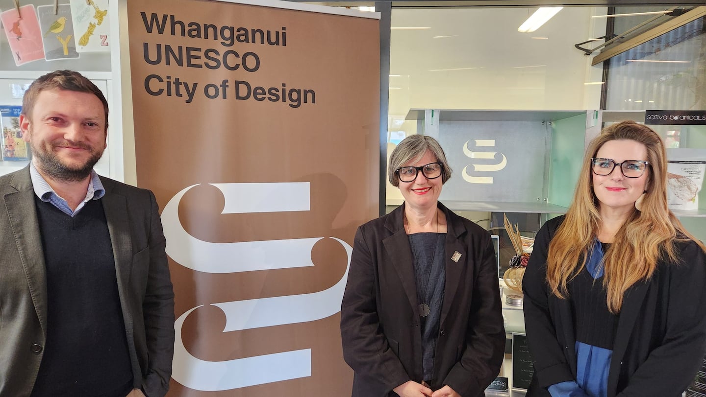
Bugden and Black are thrilled with Ohia’s design – a bold representation of Te Awa Tupua, the flowing energy of ideas and process, and people and culture intersecting with the river.
The tohu is black and white, with a special bronze rendering for the use of City of Design ambassadors and in special projects.
“I think it’s beautiful and strong and aspirational. We haven’t shown it to anybody that doesn’t feel that instant connection and response to it. That is so uplifting,” Bugden said.
She has no doubt that the tohu will elevate Whanganui’s presence in the Creative Cities Network.
“The network is such a chance for Whanganui to connect to the world and have those meaningful conversations: the chance for export, the chance for connection.
“But more than that, this is the first really tangible, juicy project where everyone in the city can live and breathe being City of Design.
“It steps out and becomes something that everybody can feel connected to and part of.
“We want people to see this and think ‘this is ours, we’re proud of this’.
“That’s a key element in truly living as a City of Design. It’s not held here at Whanganui & Partners, by the council, or a few key stakeholders – it belongs to everybody.”
LDR is local body journalism co-funded by RNZ and NZ On Air


